Tru Studio
Full branding for a photography studio
Tru Studio is the photography and video team of Steve and Anne Truppe. Their work captures lifestyle moments with authenticity, emotion and depth. They came to us in need of a new visual identity and promotional materials. Inspired by their work, we designed their brand to complement their imagery with minimalism and sophistication, using unadorned graphic elements, asymmetry, textural contrast and plenty of white space.
- Brand Strategy
- Logo Design
- Visual Identity
- Print Design
- Digital Design

Brand Vision
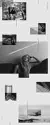
The vision for Tru Studio’s brand is an artful elegance with a European influence. We wanted Tru Studio’s photography to be the stunner in all collateral which meant designing a visual identity that becomes a canvas for it. Compositions allow for plenty of negative space around the photos, allowing them to stand apart and become the focal point. Pairings of photos combine textural with lifestyle for an interesting juxtaposition. Soft type and small icons are adhered to an invisible grid, but spaced apart to keep the negative space open and airy.


Mailer Concepts
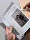
Promotional mailers for photographers are a thing. It’s what makes the first impression with Creative Directors and art buyers, so they have to be interesting to get their attention. Each mailer we designed has something unique about them—either a folding technique or a cover that also serves as a seal so there’s no need for an envelope. Every detail is considered and designed—the paper thickness and opacity, how it opens, how it seals shut for the mail, how to accommodate a personal note, and even what color the staples should be. There’s a lot of communication between us, the printer and the post office to make sure our ideas are achievable and regulation-friendly.


“Kim and Kyle created a new visual identity for our commercial photography business which elevated our brand in unique, unexpected ways that far exceeded our expectations. In addition, they helped us create printed mail promos that allowed us to stand out in a saturated industry. Knoed’s thoughtful process made for a very personal experience.”
— Steve & Anne Truppe, Founders, Tru Studio


Credits
Tru Studio, Photos + Videos
Recognition
Communication Arts ‘Exhibit’ Feature
Promo Featured on FPO (For Print Only)
Mailer Featured on FPO (For Print Only)
Mailer Featured on No Plastic Sleeves
Logo Published in “Monogram Logo” - Counter-Print