Totto’s Market
Full branding for a local grocer
Totto’s Market is a charming grocer in the heart of Chicago’s Printer’s Row neighborhood. The market is named after the owner’s dad, “Totto,” who dedicated his adult life to back-bending customer service in the grocery industry. Scott, Totto’s son, took those old-school values and merged it with a modern day market that listens to the neighborhood’s grocery needs. Here, you’ll find local and imported specialty items other markets don’t carry alongside everyday kitchen staples. Every detail with building out the market was considered, even down to wrapping the door handlebars in leather bike tape to honor Totto’s days of cycling.
- Brand Strategy
- Logo Design
- Visual Identity
- Print Design
- Environmental Graphics
- Website Design
- Launch Website


Brand Vision
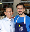
Scott is all about making people smile, whether it’s being his charming self or creating moments to brighten their day. We wanted the brand to feel like Scott, warm-n-fuzzy with undeniable character. We made everything feel human by creating imperfect illustrations and handwritten type, along with rubber stamps for the coffee cups and wooden crates so that each is unique. Juxtaposing the human qualities against crisp, clean blocks of color and modern fonts makes the brand feel cool and current.



Logo Concept
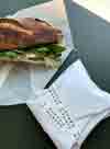
It was important to Scott that Totto’s Market sell perishable items so neighbors could find everything they need to make a meal at home. We illustrated that point (literally) by representing the different perishable categories you can find at Totto’s in the logo—bakery, floral, dairy, meat and produce. We created a set of 16 food illustrations and used them in different ways to design the collateral.


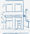
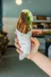







“Kim and Kyle get it. They took a thoughtful approach from day one and never let up as they brought the branding to life. When I come to work everyday, I’m reminded how focused they were on building something with heart. It makes me smile just thinking about it and I’m grateful.”
— Scott Perin, Founder, Totto’s Market



Credits
Tim Balon, Interior Architecture
Rightway Signs, Sign Production
Recognition
"Best Design Award," Asia-Pacific Design No.16, Sandu Publishing
Mindsparkle Magazine