Seed to Serum
Full branding for an eCommerce apothecary
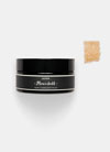
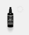
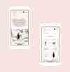
Seed to Serum is a skincare consultant and online apothecary, hand picking the best plant-based products on the market for all skin types. After proving their concept, they were ready to revamp their identity to feel more professional, cohesive and unique. We gave them a soft, playful and sophisticated brand that spoke to their target customer. Alongside the new logo and visual identity, we also designed custom mailer boxes for online orders, a premium box for gifting and kits, crystal-shaped business cards and a newly themed website.
- Brand Strategy
- Logo Design
- Visual Identity
- Print Design
- Package Design
- Web Design


Brand Vision
We pulled inspiration from minerals, old-time apothecaries and two things Megan Schwarz (Founder) loves—crystals and blush pink. The crystals inspired irregular shapes, the minerals inspired tiny dot patterns and referencing old-time apothecaries inspired the gold accent color typically found on their windows. The result is an uplifting, modern and fun brand that uses handmade watercolor textures and a mixed use of graphic patterns.


Logo Concept
We believe the most memorable logos use an icon that’s visually representative of the company name. In this case, we chose the most basic shapes—circle, caret, circle—to signify ‘seed’, ‘to’ and ‘serum’. It’s playful, easy to understand and simple. Stacking the icon and words in a grid-like fashion gives the logo an interesting balance. We rotated the T to reinforce the idea of ‘seed to serum’ and to give the logo something a little unexpected.






“We’re getting inundated with waves of accolades and very kind words. Top adjectives include ‘gorgeous!’, ‘so modern and sleek’, and ‘oh my god!’s (yes, we’ll take an omg as an adjective). We can’t thank Knoed enough for all their hard work in helping bring our branding and site up to the eleventh notch!”
— Mark & Megan Schwarz, Founders, Seed to Serum

Credits
Tru Studio, Photography
Recognition
The Dieline 2018 Trend Report
The Dieline
Mindsparkle Mag Feature
Curated Packaging Galleries By Behance