Scorched Earth Brewing Company
Full branding for a Midwest brewery
Scorched Earth Brewing Co. is a craft brewery whose name was inspired by the historical and cultural significance of Illinois prairie fires. Paying respect to their roots, old world brewing techniques and farmhouse style beers, we designed their brand to feel rugged, utilitarian, honest and hardworking like the good Midwesterners they are. Working with Scorched Earth since the brewery’s conception, our involvement included concepting and designing their visual identity, logo, submarks, custom typeface, business cards, coasters, growlers/howlers, keg collars, illustration style, beer packaging, apparel, tap handles, glassware, website and photography.
- Brand Strategy
- Logo Design
- Visual Identity
- Print Design
- Copywriting
- Website Design
- Website Development
- Package Design
- Font Design
- Illustration
- Photography
- Launch Website


Brand Vision
After doing a deep dive with Scorched Earth to gain a feel for their desired brand, we learned it should give a vibe that’s casual, artisinal, handcrafted and comfortable. We chose to use industrial materials like chipboard, kraft paper and rubber stamps combined with classic, utilitarian fonts to give an authentic, raw look. Combining those elements with letterpress printing gives the relaxed, yet high quality feel we were going for. The brick red color for Scorched Earth was inspired by fire and the desaturated palette was inspired by earth tones. Illustrations were drawn by hand to give an imperfect look that feels human and a distressed texture was used to give things a worn, rugged quality.

Logo Concept
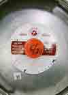
The name ‘Scorched Earth’ was inspired by prairie fires—a method used to shape and maintain prairie ecosystems—and how the fire brings rebirth and new beginnings to the ecosystems. While some prairie fires are planned and controlled, most of what’s alive today was caused by lightning fires. This idea was the inspiration behind the logo. The sun and earth are depicted in a basic form while lightning breaks the horizon and strikes the ground. We designed the logo to be circular so that it easily fits on things like bottlecaps, coasters, stamps and patches.


Typography
Being a newbie to the saturated craft beer scene, we wanted Scorched Earth to enter the market with the best face possible—typeface, that is. Going with the utilitarian look, we designed this simple, working font that looks timeless with no frills. Available only in all caps with consideration for punctuation, this typeface was designed as a display font for their logo, headlines, titles, subtitles and taglines.






“We can’t thank Knoed enough for helping us get off the ground and launch the brewery. There’s so many fond memories of the creative work that was done—we’re very proud of what they helped accomplish.”
— Mike Dallas, Founder, Scorched Earth Brewing Co.


Credits
Static Interactive, Web Development
Drew Rios, Brewery Photography
Recognition
Vintage Modern: Design with a Past
Published in Asia-Pacific Design No. 12
Published in Design360° Magazine
Website featured on The Best Designs
The Dieline Feature