Pagoda Red
Rebranding for a Chinese antiques retailer
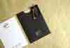
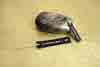
Pagoda Red is an online curator and retailer of rare and unusual artifacts from Asia, with a location in the Bucktown neighborhood of Chicago. They shine a light on undiscovered artists and artifacts, and their gallery celebrates the handmade in all its beautiful imperfections that have weathered over time. After 17 successful years in business, they came to us in need of a brand refresh, one that included a new visual identity, logo, print collateral, gift packaging and a digital catalog.
- Brand Strategy
- Logo Design
- Visual Identity
- Print Design
- App Design
- Copywriting
- Package Design


Brand Vision
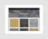
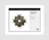
We designed their brand and materials to uphold the same qualities as their pieces—textured, timeless and sophisticated. Inspired by the Chinese philosophy of Yin and Yang, we used contrasting opposites throughout their identity—smooth and rough, shiny and matte, dark and light—to create balance and wholeness. Since most of their pieces were originally commissioned by wealthy men and women for their homes in 18th/19th century China, we chose gold as their accent color, which symbolizes wealth and riches in China. The lines in the logo are a modern, deconstructed interpretation of a pagoda and the rectangular icon was inspired by their roots and luck with the number 8.