Echo Vie
Full branding for an organic skincare company
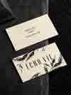
Echo Vie is a natural, nontoxic skincare brand created by makeup artist, Susie Lee, a four time cancer survivor. Her difficult experiences inspired her to become more conscious of what she was putting in and on her body, which led her to creating these products. We worked with Susie to rebrand the entire company and helped her establish a brand strategy, created a product naming system and completely redesigned the visual identity, logo, icon, packaging, labels, business cards, notecards and sales sheet.
- Brand Strategy
- Logo Design
- Visual Identity
- Print Design
- Product Naming
- Package Design
- Illustration


Brand Vision
The packaging for Echo Vie is the heart of this brand and where we started to inform and drive the identity. After researching their competition, there was an overwhelming pattern of skincare companies taking a clinical approach to their brand identity. For Echo Vie to stand out, we wanted to do things differently—we explored colored and textured papers, unique box shapes and organic illustrations to give an experience that feels premium, artisanal, warm and sensory. The final branding and identity combines ivory feltmark paper with a hand-drawn illustration and gold foil treatment on custom triangular boxes.


Logo Concept
Echo Vie means ‘a reflection of life’. Since ‘Vie’ is a French word (meaning “life”), we drew inspiration from classic Parisian monograms and lettering to create the logomark. The EV monogram and opulent letters were designed to feel both current and timeless. The ivory, black and gold color palette and botanical illustration was also inspired by something you’d find in a French apothecary.


“Within two meetings they had a thorough comprehension of my brand and the direction. I am so thrilled with the completed packaging—the end result has far exceeded my expectations.”
— Susie Lee, Founder, Echo Vie


Credits
Tru Studio and Dane Tashima, Photography
Recognition
Asia-Pacific Design No.16, Sandu Publishing
The Dieline Feature
Novum Magazine, 03.18 Issue
Mindsparkle Mag Feature