BOSS
Full branding for a hair salon
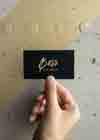
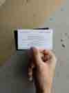
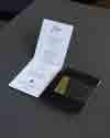
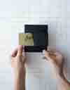
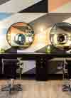
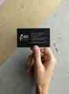
Founded in 2018, BOSS is a hair salon in Chicago’s River North district. We worked with their interior designers to design their brand in tandem with the interior of the space so everything is cohesive and on point. The custom graphic pattern was based on the salon’s tilework and the color palette was based on the paint selections. Gold foil stamping, rich black paper and extra thick business cards give their brand experience the luxe quality they were hoping for.
- Brand Strategy
- Logo Design
- Visual Identity
- Print Design
- Signage


Brand Vision
BOSS Founder, John Hill, wanted his salon to be rich with personality—industrial materials mixed with marble, gold and 80s glam rock. We wanted the vibe to reference those cues while being bold, modern, sophisticated and sleek. Inspired by the tilework plans, we designed a retro-inspired pattern that would complement the space. Bold color blocks of white and black, geometric lines and shimmers of gold make up their visual identity. The neutral palette is a great foundation for the pops of pink and blue found in the space.


Logo Concept
Leaving the salon with a fresh do can make anyone feel like a boss. You walk out of those doors with a little more attitude than when you walked in. The nature of the logo was inspired by that feeling in combination with an artist‘s signature, since stylists are all about the art of hair. The logo was drawn by hand with a calligraphy pen and then turned into vector art. The true written version is used for all collateral and a simplified version was created for the neon sign.


“Knoed is not only thorough and extremely efficient, but the amount of detail that they put into conceptualizing my vision to reality was insanely accurate and spot on. I am beyond ecstatic with the final results of my branding that I would never ever consider working with anyone else.”
— John Hill, Founder, BOSS Hair Group


Credits
Featured in APD No.15, Sandu Publishing
Christopher Bradley, Interior Photography
Blochaus, Interior Design